In my previous article, I didn't discuss Windows Vista at all, as I don't have a copy of it, however several people contacted me with screenshots, and described the system a bit.
Lets take a first look:
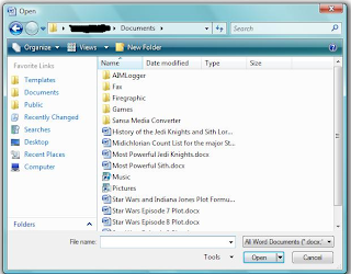
There is a lot going on here. Up on top, we have a crumbs based directory browser stolen out of GTK, but of course this dialog is better than what GTK offers. It also provides a refresh button, and has a recent directory drop down. You also get a back and forward button to jump all over when looking for something. A nice addition though is a search box. Not sure where the file is? Then search for it! A nice new intuitive feature (taken from Mac OS X though).
Below this we have options to change what's shown, and the style it's presented in. The new directory button is also plainly visible. Then on the left, we have a quick location list like former versions of Windows had, but now in Windows 6, you can add and delete them to your heart's content. I'm not sure if you can rename them though, readers please write in regarding this. We then have the standard files listing from Windows 4+, with the ability to change the view like we expected. And of course to round it off nicely, we have the file input box to jump to files names quickly, and of course type in a path to move to like us power users want. File management features are also available.
But wait, we're not done yet, check this out:
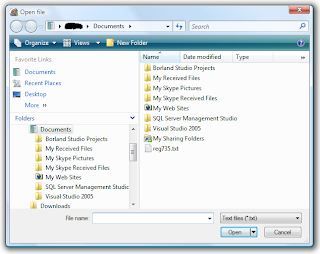 As you can see, the "Folders" section on the left can be expanded to offer a tree view to browse your system. This borrows on the directory only browser (along side a file browser) from Windows 3, but offered in a more robust tree view. It seems a bit weird to see directories in both the directory and file browsers, but this should keep everyone happy. Many people were annoyed with Microsoft for combining the two in Windows 4+, as it was harder to navigate directories, and had to jump past directories to find files.
It seems like with this new version, Microsoft is trying to please everyone, offering every type of browsing possible, and I applaud them for that. I'd be interested to know if you can turn off the directory display in the main file list pane. If anyone knows, please write in.
I'd like to personally play with this to see how it stacks up against KDE 3.5's file dialog, but this looks really solid. The only problem seems to be they stills stuck with some of their virtual directory nonsense, such that you'll see Desktop/User and Desktop/Documents, when the actual tree is Users/User/Desktop and Users/User/Documents. Guess we can't have everything.
Next up, we'll be revisiting GTK. All the responses except for one to my last article agreed with me as to how bad GTK was. Some even wrote in offering demonstrations showing how it was worse than even I knew.
The one person who wrote in disagreeing offered some interesting data. No, he wasn't a developer telling me GNOME/GTK folks were improving it, and he didn't actually disagree with what I described as being bad. He wrote in to say that he has a completely different dialog!
Let us look at our first screenshot:
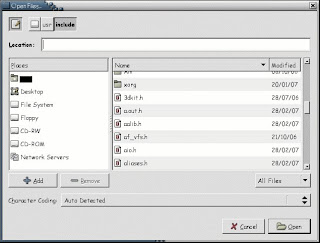
As you can see, a location bar is provided along with everything else we were familiar with, so one can quick jump, and this happens to work well. The quick locations on the left are also combined into one, so you can add and remove even the built in ones. Not sure about renaming though. But wait there's more!
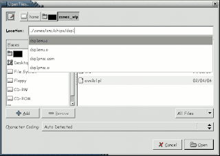
As the above shows, it also has sane auto complete, instead of an auto complete where you write /usr and end up with /usr/src. I asked for the source of these changes, if perhaps it was from a new or in development version of GTK or GNOME. I was told that he had these dialogs since he setup his PC years ago, and that it was from a usability patch that he had installed. Unfortunately though, he wasn't sure where he got them from, so I guess I'm still stuck trying to replace FireFox and GAIM on my machine.
Let us take a moment to ponder though that there are usability patches out there to vastly improve GTK/GNOME, but we still have no hint of them making their way into the official versions. Perhaps if we start boycotting GTK apps, we'll see the developers do something sane for once. It'd also be nice if it wasn't as slow as molasses.
Next, we come to the Qt file open dialog. Last time, I showed a preview of what Qt 4.3 was going to offer. It seems I got no limit to the responses thanking me for alerting them to the impending disaster.
A friend of mine who has a neat app he wrote using GTK told me how he recently added file browsing support and was very annoyed at how he had to spend a lot of time writing a new file open dialog from scratch because of how utterly atrocious the built in one was. He told me he was considering switching over to Qt because he heard how superior it is, and how he won't have to put up with such stupidity as it has sane stuff built in. However when he saw what Qt 4.3 was planning, he promptly dropped any considerations he had, as he didn't feel like he needed to switch to a GTK knock off and reimplement the file open dialog again. Let us remember that GTK originally ripped Qt off and we don't need to go flip the tables, and pay attention to the $0.02 we get from developers who can't even figure out how to write a sane file dialog.
Another good friend of mine also took it upon himself to spread the word as much as possible. He mentioned it in #qt on Freenode, an IRC channel with many Qt developers. I'm told they were furious when they saw what changes were being planned.
Apparently all this criticism made its way back to Trolltech, and Ben Meyer quickly went to work to rectify the situation.
Here's what was in Qt 4.3's repository as of this past Friday:
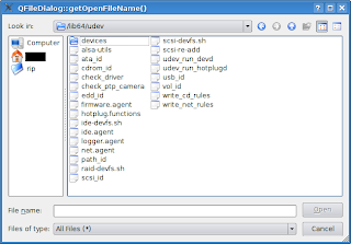 As you can see, we're basically back to what Qt 4 had, except with quick locations added to the left. The quick locations allow adding and removing, and settings are saved. Unfortunately, no renaming though, so I'll likely end up with many directories labled "src" confusing me. Also, when using the file name box to browse, the bug from the former Qt 4.3's file save name box is here. If I enter "/usr/src", it'll switch to that path, but the name box will end up stupidly containing "src". Seems like someone forgot to do an S_ISDIR(st_mode) on stat(path) before blindly filling the box with basename(path) when enter is pressed.
I have great faith in the Trolltech guys though, these guys care, and fix things promptly. Lets hope they notice this and fix it before 4.3 is ready. One neat thing about the new version though is that you never need to refresh, as the dialog monitors the directory for changes. But don't worry, the thing is lightening quick, and doesn't seem to lag for anything. I even threw it against a directory with 20,000 files, and it displayed it instantly.
Finally, regarding the KDE 3.5 dialog, I wrote last time how it was the best thing I reviewed, my only disappointment was no renaming. However I was informed that you can rename with it. When you right click on a file, the rename option is labeled "properties". Once the properties come up, you can immediately rename, however the additional benefit here is that you can also click check boxes to change the permissions on a file too! I never thought to look in properties before, as I figured it would just give me info on the file, not actually allow me to change anything. Perhaps there should be some better naming go on over there to make it more intuitive, but it is now apparent that the KDE 3.5 dialog is definitely the superior dialog I have actually reviewed.
I really like the idea of adding a search feature though, and crumb supports usefulness is debatable. So I'll toss it up between Windows 6 and KDE 3.5 as to which is the best till I get a chance to get my hands on Vista.
However, KDE 4 will probably add a search to their file open, and I expect the clever guys at Trolltech to improve further if they receive enough feedback.
If you want developers of your favorite API/OS/Desktop Environment to improve, why not point them to this and the previous file dialog reviews. The guys at Trolltech are definitely open to feedback. Just make sure you're ready for rejection if you try talking to the GTK/GNOME guys, they don't care about anything.


16 comments:
Thanks. And wow that was fast, you posted a response like 30 seconds after I published this.
1. What are you missing from kopete that gaim has?
2. Konqueror has supported netscape/mozilla plugins since forever.
3. I really like your blog mister.
You should checkout Vistas Save as dialog. It starts out small with a down arrow that when pressed makes the dialog expand upwards. :)
Up on top, we have a crumbs based directory browser stolen out of GTK, but of course this dialog is better than what GTK offers. Compared to the latest GTK file dialog users were able to navigate faster in GTK's then Vistas. The buttons around each folder appear in a little animation. I found myself waiting for the buttons to appear before clicking. Only when it was pointed out to me did I realize it.
Crud asci art where 'v' is the down arrows:
-------------
0 foo v bar v
-------------
When you hit the last down arrow does it show sub directories of foo or bar? I found myself clicking on one and then the other never really sure which one I wanted to click on.
You really have to use the dialog first hand to appreciate it :)
When changing directories in Qt's file dialog the line edit is now cleared (this fix will be in tonights snapshot). Although not a perfect solution for your issue in the sidebar the tooltip on the item contains the full path so you can differentiate between "src" and "src".
Kopete's interface is bad. I enjoy using GAIM much more.
You're actually considering a MICROSOFT concoction as the best? I'm shocked and horrified. Congrats on influencing the QT guys. As always, say hi to wifey and the little coderlings.
Sinamas:
I've been using AIM since 1996, and switched to GAIM a few years ago for the portability and lack of ads. Now I also use it for GTalk. GAIM's interface is basically that of AIM's with a few improvements, and added protocol support.
When I try to use Kopete, I'm presented with a completely different interface which I don't like. Perhaps I can tweak it to match AIM, but I never had the patience to sit down and do so, and I'm not even sure that I can. Familiarity is worth a lot of brownie points.
Now I tried to take you up on installing plugins. So I went over to http://addons.mozilla.org in Konquror, and when I click to install one, it just asks me which program to open the XPI with. Should I be doing something else?
And glad you like my blog :)
Hope you find my future articles just as interesting.
Benjamin:
Yes I should use Vista's first hand. I went to 3 computer stores this past week, and they all had balloons and cardboards and all sorts of props advertising Vista throughout the store, and I saw expensive boxes to buy, but not a single machine to demo it on. All the in store PCs to test were running XP.
I own DOS 3.3, 4, 5 (x3), 6 (upgrade), 6.2 (upgrade), 6.22 (upgrade), Windows 3, 3.1, WFW 3.11, 95 (upgrade), 98, 98SE, ME (x2), XP (x2).
I just don't feel like shelling out more for a new version of the same OS, especially now that the price has gone up like crazy.
I'd love to do a write up on Vista, but until they install it at work, or I get a new PC with it preinstalled, it doesn't seem like I'll get a chance to test drive it. It doesn't look like they'll be installing Vista on any of the PCs at the office any time soon, and the only PCs I buy with preinstalled OSs these days are laptops, and I'm not too interested in buying a new one with them all exploding lately.
Thanks for fixing the line edit problem, I'll be rsync'ing up a bit later and see if there's any more issues.
Thanks for the tip about the tooltip, although I really would appreciate the ability to rename them.
Dan:
I don't like Microsoft for the direction they took with their OSs since the mid to late 90s, or some of their business practices, but I can appreciate a product for what it is.
Other open source advocates bash anything proprietary for anything and everything, but I appreciate good software. I'm not afraid to say something is good even if it's closed source or costs money or whatever. I'll gladly pay for software if I think the price is fair for what it does, and I need and can afford the product.
I'll pass regards on to wifey and the coderlings, although I don't think the coderlings can actually be considered coderlings yet.
You'll find a "Plugins"-category under "Settings->Configure Konqueror", where you can specify which paths to search for plugins. So if you have your plugins installed to $HOME/.mozilla/plugins, you add that path and click "Scan for New Plugins". To get flash working under Debian, all you have to do is "aptitude install flashplugin-nonfree", and then have Konqueror scan for new plugins.
I _have_ experienced plugins crapping out once in a while, in which case it's usually sufficient to kill the nspluginviewer process, leaving Konqueror otherwise unharmed. You may also want to check out Konqueror's settings for tabs, pop-up blocking and ad blocking. There's also KHotKeys (search for Input Actions in kcontrol) for mouse gestures.
Sinamas:
I added ~/.mozilla/firefox/hpmgl640.default/extensions to Konqueror's plugin search, and it doesn't come up with anything. So it looks like I'll still be using FireFox for the time being.
As for flash, flashplugin-nonfree isn't available for all of Debian's architectures, only i386.
Seems we may have a misunderstanding here. I was referring to netscape plugins, not firefox-specific extensions. (Flashplayer seems to be the most popular one lately.)
It annoys me that something as proprietary as flash has become so widespread on the internet. Hopefully we'll see adequate independant implementations in a few years.
For i386 plugins on amd64 you can actually get away with an i386 nspluginviewer for Konqueror instead of a complete i386 browser.
sinamas:
Ah okay. I don't use any of the "netscape plugins", but I do use several "firefox extensions".
I've grown quite fond of GMail Notifier, Image Zoom, Slashdotter, GCache, and several others. If I were to switch browsers, I'd like to retain all these features I'm used to.
Regarding flash, I don't care that much. I'm glad I don't have to be treated to stupid or annoying, and CPU hogging videos and ads when browsing. I use a flash browser specifically for http://www.homestarrunner.com, as I feel that is the only site that needs flash and is worth going to.
regarding the firefox replacement:
you are out of luck. firefox is the only one with so many extensions ( at least firefox 3 is faster )
btw there has been a qt port of firefox from zack rusin, but it was abandoned pretty soon.
give opera and maybe dillo with patches[1] a try.
and when using ie7 ie7pro is must (i actually prefer it over firefox )
i myself do like gaim/pidgin , but i know a few people who prefer sim-im
[1] http://teki.jpn.ph/pc/software/index-e.shtml
Thanks for provide great informatic and looking beautiful blog, really nice required information & the things i never imagined and i would request, wright more blog and blog post like that for us. Thanks you once agian
Birth certificate in delhi
Birth certificate in ghaziabad
Birth certificate in gurgaon
Birth certificate in noida
How to get birth certificate in ghaziabad
how to get birth certificate in delhi
birth certificate agent in delhi
how to download birth certificate
birth certificate in greater noida
birth certificate agent in delhi
Birth certificate delhi
viraltrench
This is so fun! What a great idea.
vivi winkler
Hi...
If you want to open a dialog box in a specific folder, you have to use the method .FileDialog with the parameter msoFileDialogFilePicker.
You are also read more Instant Loan Online
Best Interior Designers in Chennai
Best Interior Decorators in Chennai
Post a Comment