Showing posts with label GTK. Show all posts

Wednesday, December 14, 2011


Progression and Regression of Desktop User Interfaces


As this Gregorian year comes to a close, with various new interfaces out now, and some new ones on the horizon, I decided to recap my personal experiences with user interfaces on the desktop, and see what the future will bring.

When I was younger, there were a few desktop environments floating around, and I've seen a couple of them at school or a friend's house. But the first one I had on my own personal computer, and really played around with was Windows 3.

Windows 3 came with something called Program Manager. Here's what it looked like:


The basic idea was that you had a "start screen", where you had your various applications grouped by their general category. Within each of these "groups", you had shortcuts to the specific applications. Now certain apps like a calculator you only used in a small window, but most serious apps were only used maximized. If you wanted to switch to another running app, you either pressed the alt+tab keyboard shortcut to cycle through them, or you minimized everything, where you then saw a screen listing all the currently running applications.

Microsoft also shipped a very nice file manager, known as "File Manager", which alone made it useful to use Windows. It was rather primitive though, and various companies released various add-ons for it to greatly enhance its abilities. I particularly loved Wiz File Manager Pro.


Various companies also made add-ons for Program Manager, such as to allow nested groups, or shortcuts directly on the main screen outside of a group, or the ability to change the icons of selected groups. Microsoft would've probably built some of these add-ons in if it continued development of Program Manager.

Now not everyone used Windows all the time back then, but only selectively started it up when they wanted something from it. I personally did everything in DOS unless I wanted to use a particular Windows app, such as file management or painting, or copying and pasting stuff around. Using Windows all the time could be annoying as it slowed down some DOS apps, or made some of them not start at all due to lack of memory and other issues.

In the summer of 1995, Microsoft released Windows 4 to the world. It came bundled with MS-DOS 7, and provided a whole new user experience.


Now the back-most window, the "desktop", no longer contained a list of the running programs (in explorer.exe mode), but rather you could put your own shortcuts and groups and groups of groups there. Rather running programs would appear at the bottom of the screen in a "taskbar". The taskbar now also contained a clock, and a "start menu", to launch applications. Some always running applications which were meant to be background tasks appeared as a tiny icon next to the clock in an area known as a "tray".

This was a major step forward in usability. Now, no matter which application you were currently using, you could see all the ones that were currently running on the edge of your screen. You could also easily click on one of them to switch to it. You didn't need to minimize all to see them anymore. Thanks to the start menu, you could also easily launch all your existing programs without needing to minimize all back down to Program Manager. The clock always being visible was also a nice touch.

Now when this came out, I could appreciate these improvements, but at the same time, I also hated it. A lot of us were using 640x480 resolutions on 14" screens back then. Having something steal screen space was extremely annoying. Also with how little memory systems had back at the time (4 or 8 MB of RAM), you generally weren't running more than 2 or 3 applications at a time and could not really appreciate the benefits of having an always present taskbar. Some people played with taskbar auto-hide because of this.

The start menu was also a tad ridiculous. Lots of clicks were needed to get anywhere. The default appearance also had too many useless things on it.

Did anyone actually use help? Did most people launch things from documents? Microsoft released a nice collection of utilities called "PowerToys" which contained "TweakUI" which you could use to make things work closer to how you want.

The default group programs installed to within the start menu was quite messy though. Software installers would not organize their shortcuts into the groups that Windows came with, but each installed their apps into their own unique group. Having 50 submenus pop out was rather unwieldy, and I personally organized each app after I installed it. Grouping into "System Tools", "Games", "Internet Related Applications", and so on. It was annoying to manually do all this though, as when removing an app, you had to remove its group manually. On upgrades, one would also have to readjust things each time too.

Windows 4 also came with the well known Windows Explorer file manager to replace the older one. It was across the board better than the vanilla version of File Manager that shipped with Windows 3.

I personally started dual booting MS-DOS 6.22 + Windows for Workgroups 3.11 and Windows 95 (and later tri-booted with OS/2 Warp). Basically I used DOS and Windows for pretty much everything, and Windows 95 for those apps that required it. Although I managed to get most apps to work with Windows 3 using Win32s.

As I got a larger screen and more RAM though, I finally started to appreciate what Windows 4 offered, and started to use it almost exclusively. I still exited Windows into DOS 7 though for games that needed to use more RAM, or ran quicker that way on our dinky processors from back then.

Then Windows 4.10 / Internet Explorer 4 came out which offered a couple of improvements. First was "quick launch" which allowed you to put shortcuts directly on your taskbar. You could also make more than one taskbar and put all your shortcuts on it. I personally loved this feature, I put one taskbar on top of my screen, and loaded it with shortcuts to all my common applications, and had one on the bottom for classical use. Now I only had to dive into the start menu for applications I rarely used.

It also offered a feature called "active desktop" which made the background of the desktop not just an image, but a web page. I initially loved the feature, as I edited my own page, and stuck in an input line which I would use to launch a web browser to my favorite search engine at the time (which changed monthly) with my text already searched for. After a while active desktop got annoying though, as every time IE crashed, it disabled it, and you had to deal with extra error messages, and go turn it on manually.

By default this new version also made every Windows Explorer window have this huge sidebar stealing your precious screen space. Thankfully though, you could turn it off.

All in all though, as our CPUs got faster, RAM became cheaper, and large screens more available, this interface was simply fantastic. I stopped booting into other OSs, or exiting Windows itself.

Then Windows 5 came out for consumers, and UI wise, there weren't really any significant changes. The default look used these oversized bars and buttons on each window, but one could easily turn that off. The start menu got a bit of a rearrangement to now feature your most used programs up front, and various actions got pushed off to the side. Since I already put my most used programs on my quick launch on top, this start menu was a complete waste of space. Thankfully, it could also be turned off. I still kept using Windows 98 though, as I didn't see any need for this new Windows XP, and it was just a memory hog in comparison at the time.

What was more interesting to me however was that at work, all our machines ran Linux with GNOME and KDE. When I first started working there, they made me take a course on how to use Emacs, as every programmer needs a text editor. I was greatly annoyed by the thing however, where was my shift highlight with shift+delete and shift+insert or ctrl+x and ctrl+v cut and paste? Thankfully though I soon found gedit and kedit which was like edit/notepad/wordpad but for Linux.

Now I personally don't use a lot of windowsy type software often. My primary usage of a desktop consists of using a text editor, calculator, file manager, console/terminal/prompt, hex editor, paint, cd/dvd burner, and web browser. Only rarely do I launch anything else. Perhaps a PDF, CHM, or DJVU reader when I need to read something.

After using Linux with GNOME/KDE at work for a while, I started to bring more of my work home with me and wanted these things installed on my own personal computer. So dual booting Windows 98 + Linux was the way to go. I started trying to tweak my desktop a bit, and found that KDE was way more capable than GNOME, as were most of their similar apps that I was using. KDE basically offered me everything that I loved about Windows 98, but on steroids. KWrite/KATE was notepad/wordpad but on steroids. The syntax highlighting was absolutely superb. KCalc was a fine calc.exe replacement. Konqueror made Windows Explorer seem like a joke in comparison.

Konqueror offered network transparency, thumbnails of everything rather quickly, even of text files (no pesky thumbs.db either!). An info list view which was downright amazing:
This is a must have feature here. Too often are documents distributed under meaningless file names. With this, and many other small features, nothing else I've seen has even come close to Konqueror in terms of file management.

Konsole was just like my handy DOS Prompt, except with tab support, and better maximizing, and copy and paste support. KHexEdit was simply better than anything I had for free on Windows. KolourPaint is mspaint.exe with support for way more image formats. K3b was also head and shoulders above Easy CD Creator or Nero Burning ROM. For Web Browsers, I was already using Mozilla anyway on Windows, and had the same option on Linux too.

For the basic UI, not only did KDE have everything I liked about Windows, it came with an organized start menu. Which also popped out directly, instead from a "programs" submenu.

The taskbar was also enhanced that I could stick various applets on it. I could stick volume control directly on it. Not a button which popped out a slider, the sliders themselves could appear on the taskbar. Now for example, I could easily adjust my microphone volume directly, without popping up or clicking on anything extra. There was an eyedropper which you could just push to find out the HTML color of anything appearing on the screen - great for web developers. Another thing which I absolutely love, I can see all my removable devices listed directly on my taskbar. If I have a disk in my drive, I see an icon for that drive appearing directly on my taskbar, and I can browse it, burn to it, eject it, whatever. With this, everything I need is basically at my finger tips.

Before long I found myself using Linux/KDE all the time. On newer machines I started to dual boot Windows XP with Linux/KDE, so I could play the occasional Windows game when I wanted to, but for real work, I'd be using Linux.

Then KDE 4 comes out, and basically half the stuff I loved about KDE was removed. No longer is it Windows on steroids. Now KDE 4.0 was not intended for public consumption. Somehow all the distros except for Debian seemed to miss that. Everyone wants to blame KDE for miscommunicating this, but it's quite clear 4.0 was only for developers if you watched the KDE 4 release videos. Any responsible package maintainer with a brain in their skull should've also realized that 4.0 was not ready for prime time. Yet it seems the people managing most distros are idiots that just need the "latest" version of everything, ignoring if it's better or not, or even stable.

At the time, all these users were upset, and all started switching to GNOME. I don't know why anyone who truly loved the power KDE gave you would do that. If KDE 3 > GNOME 2 > KDE 4, why did people migrate to GNOME 2 when they could just not "upgrade" from KDE 3? It seems to me that people never really appreciated what KDE offers in the first place if they bothered moving to GNOME instead of keeping what was awesome.

Nowadays people tell me that KDE 4 has feature parity with KDE 3, but I have no idea what they're talking about. The Konqueror info list feature that I described above still doesn't seem to exist in KDE 4. You can no longer have applets directly on your taskbar. Now I have to click a button to pop up a list of my devices, and only then can I do something with them. No way to quickly glance to see what is currently plugged in. Konsole's tabs now stretch to the full width of your screen for some pointless reason. If you want to switch between tabs with your mouse, prepare for carpal tunnel syndrome. Who thought that icons should grow if they can? It's exactly like those idiotic theoretical professors who spout that CPU usage must be maximized at all times, and therefore use algorithms that schedule things for maximum power draw, despite that in normal cases performance does not improve by using these algorithms. I'd rather pack in more data if possible, having multiple columns of information instead of just huge icons.

KHexEdit has also been completely destroyed. No longer is the column count locked to hex (16). I can't imagine anyone who seriously uses a hex editor designed the new version. For some reason, KDE now also has to act like your mouse only has one button, and right click context menus vanished from all over the place. It's like the entire KDE development team got invaded by Mac and GNOME users who are too stupid to deal with anything other than a big button in the middle of the screen.

Over in the Windows world. Windows 6 (with 6.1 comically being consumerized as "Windows 7") came out with a bit of a revamp. The new start menu seems to fail basic quality assurance tests for anything other than default settings. Try to set things to offer a classic start menu, this is what you get:


If you use extra large icons for your grandparents, you also find that half of the Control Panel is now inaccessible. Ever since Bill Gates left, it seems Windows is going down the drain.

But hardly are problems solely for KDE and Windows, GNOME 3 is also a major step back according to what most people tell me. Many of these users are now migrating to XFCE. If you like GNOME 2, why are you migrating to something else for? And what is it with people trying to fix what isn't broken? If you want to offer an alternate interface, great, but why break or remove the one you already have?

Now a new version of Windows is coming out with a new interface being called "Metro". They should really be calling it "Retro". It's Windows 3 Program Manager with a bunch of those third party add-ons, with a more modern look to it. Gone is the Windows 4+ taskbar so you can see what was running, and easily switch applications via mouse. Now you'll need to press the equivalent of a minimize all to get to the actual desktop. Another type of minimize to get back to Program Manager to launch something else, or "start screen" as they're now calling it.

So say goodbye to all the usability and productivity advantages Windows 4 offered us, they want to take us back to the "dark ages" of modern computing. Sure a taskbar-less interface makes sense on handheld devices with tiny screens or low resolution, but on modern 19"+ screens? The old Windows desktop+taskbar in the upcoming version of Windows is now just another app in their Metro UI. So "Metro" apps won't appear on the classic taskbar, and "classic" applications won't appear on the Metro desktop where running applications are listed.

I'm amazed at how self destructive the entire market became over the last few years. I'm not even sure who to blame, but someone has to do something about it. It's nice to see that a small group of people took KDE 3.5, and are continuing to develop it, but they're rebranding everything with crosses everywhere and calling it "Trinity" desktop. Just what we need, to bring religious issues now into desktop environments. What next? The political desktop?
Friday, November 6, 2009


FatELF Dead?


A while back, someone came up with a project called FatELF. I won't go into the exact details of all its trying to accomplish, but the basic idea was that like Mac OS X has universal binaries using the Mach-o object format which can run on multiple architectures, the same should be possible with software for Linux and FreeBSD, which use the ELF object format.

The creators of FatELF cite many different reasons why FatELF is a good idea, which most of us probably disagree with. But I found it could solve a pretty crucial issue today.

The x86 line of processors which is what everyone uses for their home PCs recently switched from 32-bit to 64-bit. 64-bit x86 known as x86-64 is backwards compatible with the old architecture. However programs written for the new one generally run faster.

x86-64 CPUs contain more registers than traditional x86-32 ones, so a CPU can juggle more data internally without offloading it to much slower RAM. Also, most distributions offered precompiled binaries designed for a very low common denominator, generally a 4x86 or the original Pentium. Programs compiled for these older processors can't take advantage of much of the improvements that have been done to the x86 line in the past 15 years. A distribution which targets the lowest common denominator for x86-64 on the other hand is targeting a much newer architecture, where every chip already contains MMX, SSE, similar technologies, and other general enhancements.

Installing a distribution geared for x86-64 can mean a much better computing experience for the most part. Except certain programs unfortunately are not yet 64 bit ready, or are closed source and can't be easily recompiled. In the past year or two, a lot of popular proprietary software were ported by their companies to x86-64, but some which are important for business fail completely under x86-64, such as Cisco's Webex.

x86-32 binaries can run on x86-64, provided all the libraries it needs are available on the system. However, many distributions don't provide x86-32 libraries on their x86-64 platform, or they provide only a couple, or provide ones which simply don't work.

All these issues could be fixed if FatELF was supported by the operating system. A distribution could provide an x86-64 platform, with all the major libraries containing both 32 and 64 bit versions within. Things like GTK, Qt, cURL, SDL, libao, OpenAL, and etc. We wouldn't have to worry about one of these libraries conflicting when installing two variations, or simply missing from the system.

It would make it easier on those on an x86-64 bit platform knowing they can run any binary they get elsewhere without a headache. It would also ease deployment issues for those that don't do anything special to take advantage of x86-64, and just want to pass out a single version of their software.

I as a developer have to have an x86-32 chroot on all my development systems to make sure I can produce 32 bit binaries properly, which is also a hassle. All too often I have to jump back and forth between a 32 bit shell to compile the code, and a 64 bit shell where I have the rest of my software needed to analyze it, and commit it.

But unfortunately, it now seems FatELF is dead, or on its way.

I wish we could find a fully working solution to the 32 on 64 bit problem that crops up today.

Tuesday, May 12, 2009


Will Linux ever be mainstream?


Constantly different sites and communities always discuss the possibility of Linux becoming mainstream and when the mainstreaming will take place. Often reasons are laid out where Linux is lacking. Most reasons don't seem to be in touch with reality. This will be an attempt to go over some of those reasons, cut out the fluff from the fact, and perhaps touch on a few areas that have not been gone over yet.

One could argue with today's routers that Linux is already mainstream, but let us focus more on full blown computer Linux, which runs on servers, workstation, and home computers.

When it comes to servers, the question really is who isn't running Linux? Practically every medium sized or larger company runs Linux on a couple of their servers. What makes Linux so compelling that many companies have at least one if not many Linux servers?

Servers are a very different breed of computer than the workstation or home computer. "Desktop Linux" as it's known is the type of OS for average everyday Joe. Joe is the kind of guy who wants to sit down and do a few specific tasks. He expects those tasks to be easy to do, and be mostly the same on every computer. He doesn't expect anything about the 'tasks' to scare him. He accepts the program may crash or go haywire in the middle, at which time it's just new cup of coffee time. Except Desktop Linux isn't for every day Joe ... yet.

Servers on the other hand are designed primarily for functionality. They have to have maximum up time. It doesn't matter if the server is hard to understand, and work with, and only two guys in the whole office can make heads or tails out of it. It's okay that the company needs to hire two guys with PhDs, who are complete recluses, and never attend a single office party.

Windows servers are primarily used by those that need special Windows functionality at the office, such as ActiveDirectory, or Exchange so everyone has integrated Outlook. Some even use Windows as HTTP Servers and the like. Windows is less known for working, but being great for those specialized tasks, or servers which don't need those two PhD recluses to manage. Even guys who have never written a piece of code in their entire life can manage a Windows server - usually. Microsoft always tries to press this latter point home with all their get the facts campaigns.

The real fact is though that companies on their servers need functionality, reliability, and countability. While larger companies would prefer to replace every man with a machine which is guaranteed to last forever and not require a single ounce of maintenance, they would rather rely on personnel than hardware. Sure, when I'm a really small business, I'd rather have a server I can manage myself and have a clue what I'm doing, but if I had the money, I'd rather have expert geeky Greg who I can count on to keep our hardware setup afloat. Even when geeky Greg is a bit more expensive than laid-back Larry, I'm happier knowing that I have the best people on the job.

Windows servers while being great in their niches, are also a pain in the neck in more generalized applications. We have a Windows HTTP/FTP server at work. One day it downloads security patches from Microsoft, and suddenly HTTP/FTP stop working entirely. Our expert laid-back Larry spent a few hours looking at the machine trying to find out what changed, and mostly had to resort to using Google as opposed to any knowledge of how Windows works. Finally he sees on some site that Microsoft changed some firewall settings to be extra restrictive, and managed to fix the problem.

Another time, part of the server got hacked into, and we have to reinstall most of it. For some reason, a subsection of our site just refused to work, apparently a permission problem somewhere. On Linux/Apache, permission problems are either a setting in Apache or on the file system, easy to find. Windows on the other hand, with their oh-so-much-better fine grained permission support seem to have dozens if not hundreds of places where to look for security settings. This took our Larry close to two weeks to fix.

Yet another time, a server application which we wrote in-house ran flawlessly on both Linux and Windows XP. However, when we installed it on our Windows Server 2003 server, it inexplicably didn't work. It's no wonder companies use Linux servers for many server tasks. There's also a decent amount of server applications a company can purchase from Red Hat, IBM, Oracle, and a couple of other companies. Linux on the server clearly rocks, even various statistical sites agree.

Now let us move on to the workstation and home computer segment, where we'll see a very different picture.

On the workstation, two features are key, manageability, and usability. Companies like to make sure that they can install new programs across the board, that they can easily update across the board, and change settings on every single machine in the office from one location. Granted on Linux one can log in as root to any machine and do what they want, but how many applications are there that allow me to automate management remotely? For example, apt-get (and its derivatives) are known as one of the best package managers for Desktop Linux, yet they don't have any way to send a call to update to every single machine on a network. Sure using NFS I can have an ActiveDirectory like setup where any user can log into any machine and get their settings and files, but how exactly do I push changes to the software on the machines themselves? Every place I asked this question to seems to have their own customized setup.

One place SSHs into every single machine individually, and then paste some huge command into the terminal. Another upgrades one machine, mirrors the hard drive, then goes to each machine in turn and re-images the installed hard disk. One place which employs a decent number of programmers wrote a series of scripts which every night download a file from a server and execute it. Another, also with an excellent programming task force, wrote their own SSH based application which logs into every machine on the network and runs whichever commands the admin puts in on all of them, allowing real time pushing of updates to all the machines at once.

Is it any wonder that a large company is scared to have Linux on all their machines or that it really is expensive to maintain? We keep toting/hearing how amazing X is because of the client/server setup, or these days in regards to PulseAudio, let us start hearing it for massive remote management. And remember not to limit this just to installing packages, we need to be able to change system files remotely and simultaneously, with a method which becomes standard.

The other aspect if of course usability, and by usability I mean being able to use the kind of software the company needs. Now for some companies, documents, spreadsheets, and web browsers are the extent of the applications they need, and for that we're already there. Unless of course they also need 100% compatibility with the office suites used by other companies.

What about specialized niches though? That's where real companies have their major work done. These companies are using software to manage medical history, other clientèle meta-data, stocks (both monetary and in-store), and multitudes of other specialized fields. All these applications more or less connect to some server somewhere and do database manipulation. We're really talking about webapps in desktop form. Why is every last one of these 3rd party applications only written for Windows?

The reasons are probably threefold. If these applications worked in any standard browser, we're really providing more functionality in them than should be exposed to the user. Do you want the user to hit stop or the close button in the corner of their browser in middle of a transaction? Sure, the database should be robust and atomic enough to handle these kinds of situations, but do we want to spoon-feed these situations to the users? We also certainly don't want general system upgrades which would install a newer version of the browser to break one of the key applications being used by the company. To solve this problem requires a custom browser, bringing us back to square one when it comes to making this a desktop application.

The next reason is known as catch-22. Why should a generic company making an application bother with anything than the most popular OS by a landslide? We need way more Desktop Linux users for a company to bother, but if the companies don't bother, it's unlikely that Desktop users will switch to Linux. Also, as I've said before, portability isn't difficult in most cases, but most won't bother unless we enlighten them.

Lastly, many of these applications are old, or at least most of their code base is. There's just no incentive to rewrite them. And when one of these applications is made in-house, it'll be made for what the rest of the company is already running.

To get Linux onto the workstation then, we need the following to take place:
  • Creation of standardized massive management tools
  • Near perfect interoperability of office suites
  • Get ports of Linux office suites to be mainstream on Windows too
  • Get work oriented applications on Windows to be written portably
  • Make Linux more popular on the Desktop in all aspects
We have to stop being scared of Open Source on closed sourced Operating Systems, if half the offices out there used Open Office on Windows, they wouldn't mind running Open Office on Linux, and they won't have any different interoperability issues that they don't already have.

We also need to make portability excellence more the norm. These companies could benefit a lot from using Qt for example. Qt has great SQL support. Qt contains a web browser so webapps can be made without providing anything unnecessary in the interface. Qt also has great easy to use client/server support, with SSL to boot. Also, Qt applications are probably the easiest type to make multilingual, and the language can be changed on the fly, which is very important for apps used world wide, or for companies looking to save money by hiring immigrants. Lastly, Qt is easier to use than the Win32 API for these relatively basic applications. If they used 100% Qt, the majority of the time, the program would work on Linux with just a simple recompile.

For the above to happen we really need a major Qt push in the developer community. The fight between GTK, wxWidgets, and Qt is going to be hurting us here. Sure, initially Qt was a lot more closed, and we needed GTK to push Qt in the right direction. But today, Qt is LGPL, offers support/maintenance contracts, and is a good 5-10 years ahead of GTK in breadth of features supplied. Even if you like GTK better for whatever reason, it really can't stand up objectively to Qt from the big business perspective. We need developers to get behind our best development libraries. We also need to get schools to teach the libraries we use as part of the mainstream curriculum. Fracturing the community on this point is only going to hurt us in the long run.

Lastly, we come to Linux on the home computer. What do we need on a home computer exactly? They're used for personal finances, homework, surfing the web, multimedia, creativity, and most importantly, gaming.

Are the finance applications available for Linux good enough? I really have no idea, perhaps someone can enlighten me in the comments. We'll get back to this point shortly.

For homework, I'd say Linux was there already. We have Google and Wikipedia available via the world wide web. Dictionaries and Thesauruses are available too. We got calculators and documents, nothing is really missing.

For surfing the web we're definitely there, no questions asked.

Multimedia we're also there aside from a few annoyances. I'll discuss this more below.

For creativity, I'm not sure where we are. Several years back, it seems all the kids used to love making greeting cards, posters, and the like using programs such as The Print Shop Deluxe or Print Artist. Do we have any decent equivalents on Linux?

Thing is, a company would have to be completely insane to port popular home publishing software to Linux. First there's all the reasons mentioned above regarding catch-22 and the like. Then there's nutjobs like Richard Stallman out there who will crucify the company attempting to port their software to Linux. For starters, see this article which says:
Some of the most important projects on our list are replacement projects. These projects are important because they address areas where users are continually being seduced into using non-free software by the lack of an adequate free replacement.


Notice how they're trying to crush Skype for example. Basically any time a company will port their application to Linux, and it becomes popular enough on Desktop Linux, you'll have these nutjobs calling for the destruction of said program by completely reimplementing it and giving it away for free. And reimplement it they do, even if not as effectively, but adequate enough to dissuade anyone from ever buying the application. Then the free application gets ported to Windows too, effectively destroying the company's business model and generally the company itself. Don't believe they'll take it that far? Look how far they went to stop Qt/KDE. Remember all those old office suites and related applications available for Linux a decade ago? How many of them are still around or in business? When free versions of voice chatting are available on all platforms, and can even interface with standard telephones, do you think Skype will still be around?

Basically, trying to port a popular application to Linux is a great way to get yourself a death sentence. If for example Adobe ever ported Photoshop to Linux, there'd be such a massive upsurge in getting the GIMP or a clone to have a sane interface, and get in some of those last features, Photoshop would probably be dead in a year.

And unless some of these applications are ported to Linux, we'll probably never see niche applications as good as their Windows counterparts. Many programmers just don't care enough to develop these to the extent needed, and some only do so when they feel it's part of a holy war. Thus giving us a whole new dimension to the catch-22.

Finally, we come to gaming. Is Linux good enough for companies to develop for? First glance, and you think a resounding yes. A deeper look reveals otherwise. First off, there's good ol` video. For the big games today, it's all about graphics. How many video cards provide full modern OpenGL support on Linux? The problem is basically as follows. X Windows a system designed way back when with all sorts of cool ideas in mind, where the current driver API is simply not enough to take full advantage of accelerated OpenGL. You can easily search online and find tons of results on why X is really bad, but it really stands out when it comes to video.

NVidia has for several years now put out "evil drivers" which get the job done, and provide fantastic OpenGL support on top of Linux. The drivers though are viewed as evil, since they bypass the bottom 1/3 of X and talk straight to the Kernel, and don't fully follow the X driver API. And of course, they're also closed source. All the other drivers today for the most part communicate with the system via the X API, especially the open sourced drivers. Yet they'll never measure up, because X prevents them from measuring up. But they'll continue to stick to what little X does provide. NVidia keeps citing they can't open source their drivers because they'll lose their competitive advantage. Many have questioned this, as for the most part, the basic principals are the same on all cards, what is so secret in their drivers? When in reality, if they open sourced their drivers, the core functionality would probably be merged into X as a new driver API, allowing ATI and Intel to compete on equal footing, losing their competitive advantage. It's not the card per sè they're trying to hide, but the actual driver API that would allow all cards to take advantage of themselves, bypassing any stupidity in X. At the very least, ATI or Intel could grab a lot of that code and make it easier for themselves to make an X-free driver that works for X well.

When it comes down to it, as tiny as the market share is that Linux already has, it becomes even smaller if you want to release an application that needs good video support. On the other hand, those same video cards work just fine in Windows.

Next comes sound, which I have discussed before. The main sound issue for games is latency, and ALSA (the default in Linux) is really bad in that regard. This gets compounded when sound has to run through a sound server on its way to the drivers that talk to the sound card. For playing music, ALSA seems just fine to everybody, you don't notice or care that the sound starts or stops a moment or two after you press the button. For videos as well, it's generally a non-issue. In most video formats, the video takes longer to decode than it does to process sound, so they're ready at the same time. It also doesn't have to be synced for input. So everything seems fine. In the worst case scenario, you just tell your video player to alter the video/audio sync slightly, and everything is great.

When it comes to games, it's an entirely different ballpark. For the game not to appear laggy, the video has to be synced to the input. You want the gun to fire immediately after the user presses the button, without a lag. Once the bullet hits the enemy and the user sees the enemy explode, you want them to hear that enemy explode. The audio has to be synched to the video. Players will not accept having the sound a second or two late. Now means now. There's no room for all the extra overhead that is currently required.

I find it mind boggling that Ubuntu, a distribution designed for average Joe, decided to make the entire system routed through PulseAudio, and see it as a good thing. The main advantage of PulseAudio is that it has a client/server architecture so that sound generated on one machine can be output on another. How many home users know of this feature, let alone have a reason to use it? The whole system makes sound lag like crazy.

I once wrote a game with a few other developers which uses SDL or libao to output sound. Users way back when used to enjoy it. Nowadays with ALSA, and especially with PulseAudio which SDL and libao default to outputting to in Ubuntu, users keep complaining that the sound lags two or more seconds behind the video. It's amazing this somehow became the default system setup.

Next is input. This one is easy right? Linux surely supports input. Now let me ask you this, how many KDE or GNOME games have you seen that allow you to control them via a Joystick/Gamepad? The answer is quite simply, none of them do. Neither Qt nor GTK provide any input support other than keyboard or mouse. That's right, our premier application framework libraries don't even support one of the most popular inventions of the 80s and 90s for PC gamers.

Basically, here you'll be making a game and using your library to handle both keyboard and mouse support, when you want to add on joystick support, you'll have to switch to a different library, and possibly somehow merge a completely different event loop into the main one your program uses for everything else. Isn't it so much easier on Windows where they provide a unified input API which is part of the rest of the API you're already using?

Modern games tend to include a lot of sound, and more often than not, video as well. It'd be nice to be able to use standard formats for these, right? The various APIs out there, especially Phonon (part of Qt/KDE) is great at playing sound or video for you. But which formats should you be putting your media in? Which formats are you ensured will be available on the system you're deploying on? Basically all these libraries have multiple backends where support can be drastically different, and the most popular formats, such as those based on MPEG standards don't come standard on most Linux distributions, thanks to them being "non free". Next you'll think fine, let us just ship the game with uncompressed media. This actually works fine for audio, but is a mess when it comes to video. Try making a pure uncompressed AVI and running it in Xine, MPlayer, and anything else that can be used as a Phonon back end. No two video players can agree on what the uncompressed AVI format is. Some display the picture upside down, some have different visions of which byte signifies red, blue, and green, and so on.

For all of these reasons, the game market, currently the largest in home software, has difficultly designing and properly deploying games on Linux. The only companies which have managed to do it in the past are those that made major games for DOS back in the day, where there also was no good APIs or solutions for doing anything.

Now that we wrapped it all up from the actual applications side of things, let us have a look at actual usability for the home user.

We're taken back to average Joe who wants to setup his machine. He's not sure what to do. But he hears there are great Ubuntu forums where he can ask for help. He goes and asks, and gets a response similar to the following:

Open a terminal, then type:
sudo /etc/init.d/d restart
ln -s /alt/override /bin/appstart
cd /etc/app
sudo nano b.conf

Preload=yes
ctrl+x
yes

Does anyone realize how intimidating this is? Even if average Joe was really Windows Power User Joe, does he really feel safe entering commands with which he is unfamiliar?

In the Windows world, we'd tell such a user to open up Windows Explorer, navigate to certain directories, copy files, edit files with notepad and the like. Is it really so hard to tell a user to open up Nautilus or Dolphin or whatever their file manager is, and navigate to a certain location and edit a file with gedit/kwrite?

Sure, it is faster to paste a few quick commands into the terminal, but we're turning away potential users. The home user should never be told he has to open a terminal. In 98% of the cases he really doesn't and what he wants/needs can be done via the GUI. Let us start helping these users appropriately.

Next is the myth about compiling. I saw an article written recently that Linux sucks because users have to compile their own software. I haven't compiled any software on Linux in years, except for those applications that I work on myself. Who in the world is still perpetuating this myth?

It's actually sad to see some distributions out there that force users to recompile stuff. No I'm not talking about Gentoo, but Red Hat actually. We have a server running Red Hat at work, we needed mod_rewrite added to it the other day. Guess what? We had to recompile the server to add that module. On Debian based distros one just runs "a2enmod rewrite", and presto the module is installed. Why the heck are distros forcing these archaic design principals on us?

Then there's just the overall confusion, which many others point out. Do I use KDE or GNOME? Pidgin or Kopete? Firefox or Konqueror? X-Chat or Konversation? VLC or MPlayer? RPM or DEB? The question is, is this a problem? So what if we have a lot of choices.

The issue arises when the choice breaks down the field. When deploying applications this can get especially nightmarish. We need to really focus more on providing just the best solution, and improving the best solution if it's lacking in an area, as opposed to having multiple versions of everything. OSS vs. ALSA, RPM vs. DEB, and a bunch of others which are base to the system shouldn't really be around these days.

The other end of the spectrum is less important to providing a coherent system for deploying on. But it does confuse some users. When I want to help someone, do I just assume they use Krusader as a file manager? Should I try to be generic about file managers? Should I have them install Krusader so I can help them? This theme is played over in many variations on most Linux help forums.
"Oh yes, go open that in gedit."
"Gedit? What's Gedit?"
"Are you running KDE or GNOME?"
"GNOME"
"Are you sure?"
"Wait, are GNOME and XFCE the same thing?"

What's really bad though is when users understand there's multiple applications, but can't find one to satisfy them. It's easy when the choices are simple or advanced, you choose the one more suited to your tastes for that kind of application. But it gets really annoying when one of those apps tries to be like the other. Do we need two apps that behave exactly the same but are different? If you started different, and you each have your own communities, then stay different. We don't need variety when there is no real difference. KDE 4 trying to be more like GNOME is just retarded. Trying to steal GNOME's user base by making a design which appeals more to GNOME users but has a couple of flashy features isn't a way to grow your user base, it's just a way to swap one for another.

Nintendo in the past couple of years was faced with losing much of their user base to Sony. For example, back in the late 90s, all the cool RPGs for which Nintendo was known, had all sequels moved to Sony hardware. However, instead of trying to win back old gamers, they took an entirely different approach. Nintendo realized the largest market of gamers weren't those on the other systems, but those that weren't on any systems. The largest market available for targeting is generally those users not yet in the market, unless the market in question is already ubiquitous.

That said, redesigning an existing program to target those who are currently non-users can sometimes have the potential to alienate loyal users, depending on what sort of changes are necessary, so unless pulling in all the non-users is guaranteed, one should be careful with this strategy. Although a user base with non paying customers is more likely to have success with such a drastic change, as they aren't dependent on their users either way. Balance is required, so many new users are acquired while a minimal amount of existing users are alienated.

To get Linux on home computers the following needs to take place:
  • We need to stop fighting every company that ports a decent product to Linux
  • We should write good programs even if there is nothing else to compete with on Linux
  • We shouldn't leave programs as adequate
  • We need a real solution to the X fiasco
  • We need a real solution to the sound mixing/latency fiasco, and clunky APIs and more sound servers isn't it
  • We need to offer tools to the gaming market and try to capture it
  • Support has to be geared towards the users, not the developers
  • Stop the myths, and prevent new users installing distros that perpetuate them
  • Stop competition between almost identical programs
  • Let programs that are similar but very different go their own ways
  • Bring in users that don't use anything else
  • Keep as many old users as possible and not alienate them
Linux being so versatile is great, and hopefully it will break into new markets. As I said before, many routers use Linux. To be popular on the desktop though, it either has to get users to desktops that currently don't have any, or manage to steal users from other desktops while keeping the ones they have. Becoming Windows isn't the answer, as others like to point out, but competing toe to toe in all existing areas while obtaining new ones is. In some areas, we may just have to throw away existing users to an extent (possibly eliminate X), if we want to grab everyone else out there.

Speaking of versatility, has everyone seen this? Linux grown technology does in many ways have the potential to beat Windows and the rest in a large way.

Everyone remember Duke Nukem Forever? Supposedly the best game ever, since it has unprecedented levels of world operability within the game? Such as being able to go to a soda machine, put in some money, press buttons, and buy a drink. With Qt, we can provide a game with panels throughout it where a user can control many things within the game, and there'd be a rich set of controls developers can easily add. Imagine playing a game where you go checkout the enemy's computer system, the system seeming pretty normal, you can bring up videos of plans they plan on. Or notice a desktop with a web browser, where you yourself can go ahead and login and check your E-Mail within the game itself, providing a more real experience. Or the real clincher. You know those games where plot-wise you break into the enemy factory and reprogram the robots or missiles or whatever? With Qt, the "code" you're reprogramming can be actual JavaScript code used in game. If made simple enough, it can seem realistic, and really give a lot of flexibility to those that want to reprogram the enemy's design. We have the potential to provide unprecedented levels of gameplay in games. If only we could get companies to put out games using Qt+OpenGL+Phonon, which they will probably not even consider looking at until Qt has Joystick support. Even then we still need to promote Qt more, which will make it easier to get companies to port games to Linux...

I think Ubuntu has some good ideas for adopting home users, but could be improved upon in many ways. Ultimately, we need a lot of change in the area of marketing to home users. There's so much that needs to be fixed and in some areas, we're not even close.

Feel free to post your comments, arguments, and disagreements.

Sunday, April 1, 2007


File Dialogs - Take 2


My previous article on file dialogs generated much feedback, and I got varied responses from all kinds of people. I'll go over the feedback I got, more data I've received, and what ramifications the last discussion produced.

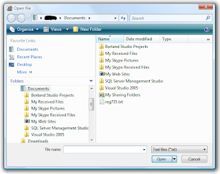
In my previous article, I didn't discuss Windows Vista at all, as I don't have a copy of it, however several people contacted me with screenshots, and described the system a bit.

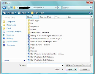
Lets take a first look:


There is a lot going on here. Up on top, we have a crumbs based directory browser stolen out of GTK, but of course this dialog is better than what GTK offers. It also provides a refresh button, and has a recent directory drop down. You also get a back and forward button to jump all over when looking for something. A nice addition though is a search box. Not sure where the file is? Then search for it! A nice new intuitive feature (taken from Mac OS X though).

Below this we have options to change what's shown, and the style it's presented in. The new directory button is also plainly visible. Then on the left, we have a quick location list like former versions of Windows had, but now in Windows 6, you can add and delete them to your heart's content. I'm not sure if you can rename them though, readers please write in regarding this. We then have the standard files listing from Windows 4+, with the ability to change the view like we expected. And of course to round it off nicely, we have the file input box to jump to files names quickly, and of course type in a path to move to like us power users want. File management features are also available.

But wait, we're not done yet, check this out:

As you can see, the "Folders" section on the left can be expanded to offer a tree view to browse your system. This borrows on the directory only browser (along side a file browser) from Windows 3, but offered in a more robust tree view. It seems a bit weird to see directories in both the directory and file browsers, but this should keep everyone happy. Many people were annoyed with Microsoft for combining the two in Windows 4+, as it was harder to navigate directories, and had to jump past directories to find files.

It seems like with this new version, Microsoft is trying to please everyone, offering every type of browsing possible, and I applaud them for that. I'd be interested to know if you can turn off the directory display in the main file list pane. If anyone knows, please write in.

I'd like to personally play with this to see how it stacks up against KDE 3.5's file dialog, but this looks really solid. The only problem seems to be they stills stuck with some of their virtual directory nonsense, such that you'll see Desktop/User and Desktop/Documents, when the actual tree is Users/User/Desktop and Users/User/Documents. Guess we can't have everything.

Next up, we'll be revisiting GTK. All the responses except for one to my last article agreed with me as to how bad GTK was. Some even wrote in offering demonstrations showing how it was worse than even I knew.

The one person who wrote in disagreeing offered some interesting data. No, he wasn't a developer telling me GNOME/GTK folks were improving it, and he didn't actually disagree with what I described as being bad. He wrote in to say that he has a completely different dialog!

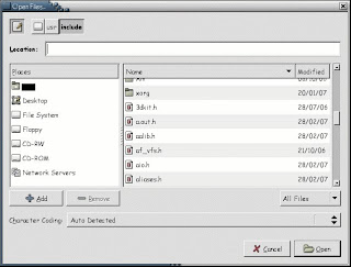
Let us look at our first screenshot:


As you can see, a location bar is provided along with everything else we were familiar with, so one can quick jump, and this happens to work well. The quick locations on the left are also combined into one, so you can add and remove even the built in ones. Not sure about renaming though. But wait there's more!


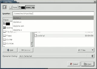
As the above shows, it also has sane auto complete, instead of an auto complete where you write /usr and end up with /usr/src. I asked for the source of these changes, if perhaps it was from a new or in development version of GTK or GNOME. I was told that he had these dialogs since he setup his PC years ago, and that it was from a usability patch that he had installed. Unfortunately though, he wasn't sure where he got them from, so I guess I'm still stuck trying to replace FireFox and GAIM on my machine.

Let us take a moment to ponder though that there are usability patches out there to vastly improve GTK/GNOME, but we still have no hint of them making their way into the official versions. Perhaps if we start boycotting GTK apps, we'll see the developers do something sane for once. It'd also be nice if it wasn't as slow as molasses.

Next, we come to the Qt file open dialog. Last time, I showed a preview of what Qt 4.3 was going to offer. It seems I got no limit to the responses thanking me for alerting them to the impending disaster.

A friend of mine who has a neat app he wrote using GTK told me how he recently added file browsing support and was very annoyed at how he had to spend a lot of time writing a new file open dialog from scratch because of how utterly atrocious the built in one was. He told me he was considering switching over to Qt because he heard how superior it is, and how he won't have to put up with such stupidity as it has sane stuff built in. However when he saw what Qt 4.3 was planning, he promptly dropped any considerations he had, as he didn't feel like he needed to switch to a GTK knock off and reimplement the file open dialog again. Let us remember that GTK originally ripped Qt off and we don't need to go flip the tables, and pay attention to the $0.02 we get from developers who can't even figure out how to write a sane file dialog.

Another good friend of mine also took it upon himself to spread the word as much as possible. He mentioned it in #qt on Freenode, an IRC channel with many Qt developers. I'm told they were furious when they saw what changes were being planned.

Apparently all this criticism made its way back to Trolltech, and Ben Meyer quickly went to work to rectify the situation.

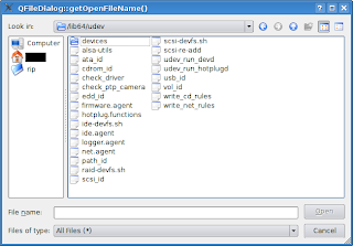
Here's what was in Qt 4.3's repository as of this past Friday:

As you can see, we're basically back to what Qt 4 had, except with quick locations added to the left. The quick locations allow adding and removing, and settings are saved. Unfortunately, no renaming though, so I'll likely end up with many directories labled "src" confusing me. Also, when using the file name box to browse, the bug from the former Qt 4.3's file save name box is here. If I enter "/usr/src", it'll switch to that path, but the name box will end up stupidly containing "src". Seems like someone forgot to do an S_ISDIR(st_mode) on stat(path) before blindly filling the box with basename(path) when enter is pressed.
I have great faith in the Trolltech guys though, these guys care, and fix things promptly. Lets hope they notice this and fix it before 4.3 is ready. One neat thing about the new version though is that you never need to refresh, as the dialog monitors the directory for changes. But don't worry, the thing is lightening quick, and doesn't seem to lag for anything. I even threw it against a directory with 20,000 files, and it displayed it instantly.

Finally, regarding the KDE 3.5 dialog, I wrote last time how it was the best thing I reviewed, my only disappointment was no renaming. However I was informed that you can rename with it. When you right click on a file, the rename option is labeled "properties". Once the properties come up, you can immediately rename, however the additional benefit here is that you can also click check boxes to change the permissions on a file too! I never thought to look in properties before, as I figured it would just give me info on the file, not actually allow me to change anything. Perhaps there should be some better naming go on over there to make it more intuitive, but it is now apparent that the KDE 3.5 dialog is definitely the superior dialog I have actually reviewed.

I really like the idea of adding a search feature though, and crumb supports usefulness is debatable. So I'll toss it up between Windows 6 and KDE 3.5 as to which is the best till I get a chance to get my hands on Vista.
However, KDE 4 will probably add a search to their file open, and I expect the clever guys at Trolltech to improve further if they receive enough feedback.

If you want developers of your favorite API/OS/Desktop Environment to improve, why not point them to this and the previous file dialog reviews. The guys at Trolltech are definitely open to feedback. Just make sure you're ready for rejection if you try talking to the GTK/GNOME guys, they don't care about anything.

Tuesday, March 20, 2007


File dialogs


The file dialogs we use on a day to day basis have changed significantly over the years. Sometimes for the better, sometimes for the worse.

Back in the dark ages of operating systems, we have the old Windows 3 file open dialog:

It might be old and considered outdated, but it was quite elegant. You had a drive selector, a directory selector, the file selector, a filter for files, and a box to type in the name of the file you wanted for quick access. It was all very nice, the only flaws being seemingly bad organization, and lacking some features the later ones added.

Windows 4 came along and offered a major reorganization with several new features:

Here all the drives, directories, and files were combined into one pane. A virtual parent called My Computer (renamable) was created to house all the drives, so it could all be dealt with in a uniform manner, as drives themselves were also just logical subdirectories. A drop down tree was added to easily jump back anywhere to one of the parent directories. Minor file management could be done here, such as renaming a file/directory, or creating a new one for whatever you wanted to save. You could also list files in the multi line scrolling list, or select a detailed view to see files with information such as dates and sizes, in case one of these would help you remember which file it was you were looking for. You also got icon support for viewing types and displaying executables.

But my favorite addition to all of this was the file name box. You could type in quickly which file/directory you were looking for, as opposed to just the filename like in Windows 3. But the best part was you could enter a path! If you knew the path you wanted to jump to, it was often quite quicker for those of us that know how to type to just enter the location manually, than to spend time navigating with point and click, and waiting for directories to load. You were able to type in relative or absolute paths, or even type in the full path of the file you wanted and have it work instantly with no time wasted. I absolutely loved it.

Then Windows 5 came along, and they offered some additions, nothing too different, but changes nonetheless:

It basically was the same file dialog from Windows 4, but they added a quick directory pane to the left side. Now one could easily jump to popular locations without having to do much more than a single click. Now I'm a bit sketchy on this detail, someone correct me if I'm wrong, but I recall you couldn't add or remove which quick location buttons appeared on the left, unless you installed Tweak UI, which makes the feature a bit useless by default.

What annoyed me most about the quick location buttons though was how useless it was. If you're not on a network, what does Network Places do for you? You also had quick access to the desktop, which, if you use your desktop properly, is quite pointless. The desktop is a good place to gather links (shortcuts) for frequently used apps, not to gather applications or various documents. How often does someone who cleanly manages their computer need to jump to the desktop to launch an application via a file open dialog? For those of us who know how to type, My Computer shortcut there was also pointless. Why would I go to My Computer? To open F: perhaps? I find typing F: directly to be faster than moving the mouse and clicking, and if I had more details about where I wanted to go offhand, I would enter that too. I ended up feeling while this was an intriguing addition, it was completely useless to power users - those who managed their files neatly, knew how to type, and had more of a clue where they kept their stuff.

Another highly annoying thing I found was the entire virtual directory setup. First there's My Documents. What exactly should one be storing in My Documents? When I first noticed that in Windows 98, I figured that's where various text files, papers, spreadsheets, and presentations might go. Should I stick source code to my app in there? Should I have Command & Conquer 3 store its save files there? If I was ripping a DVD would it go there? Should my virus scanner save log files there?

Now if I'm in My Documents, and I press directory up, instead of going to my home directory, I reach My Desktop. What's the logic behind this? And don't try to go up from My Desktop either, you won't go anywhere. Your home directory compared to UNIX also seems completely illogical. What does one put in their home directory? A casual glance at it and you see My Documents, internet browsing related directories, and hidden application settings. Would I put my personal applications here? What about stuff I want to share with all users of the computer, say pictures of my kids? Now I personally would set aside a whole drive for things like pictures of the kids and have it all organized neatly, and then have it symlinked to from the home directory of each family member. Yet Windows seems to not really have any provisions for this. Symlinks are non existent, and the shortcut system is a joke, which just constantly acts weird when you try to set a link to another drive or directory and you scratch your head wondering why did a new instance of Windows Explorer just launch?

I'm told Vista got some of this user stuff improved, but I've yet to see it, as I don't feel like shelling out several hundred for something I've already spent a considerable amount on for previous versions.

I'd appreciate if users of Windows 6 (Vista) could write in and tell me if we actually have sane home management, and that the virtual directory nonsense has been sanitized. Also would be nice to know if one can easily add or remove quick locations this time around.

Oh and before I finish on this one, Windows 5 also allowed thumbnail viewing of multimedia files in the file dialogs, in addition to other useful views added.


Now lets take a look at some of the UNIX counterparts.


First off we have the despicable GTK/GNOME file dialog. Sorry for those of you that now have to go poke their eyes out from seeing this, but it has to be shown:

Now while it looked pretty much the same as it does now compared to say, 3 years back, it has had some changes since then.
It displays a directory/file browser quite clearly along with the date of everything in a simple scroll down view. Don't bother looking for any way to change the view or to get any additional details to show up such as file size. I assume they think they make up for it though by allowing you to reverse the order of the alphabetical sorting, or by allowing sorting via date. Although like other open dialogs, they got the file type filter right. Now in style with a group which likes to copy everything Microsoft does with Windows, but try to put a new spin on it and say all their goals are to do everything different than Windows; they copied the quick locations browser on the left, right down to a completely useless irremovable desktop quick location. Although it's nice to see they included home, and surprisingly enough they have a section where you can easily add or remove your own additions to the quick locations (but not remove the built in ones).
One thing which might be an improvement is the crumb browsing on top. Unlike Windows 4+ where they offered a drop down of the directory tree, you now see each directory component in a button by itself, and you can easily immediately click on the one you want to jump to. This mechanism was also combined with the traditional up button which is no longer needed with this interface. A nice idea indeed, which I think might make life easier for more inexperienced users, and perhaps getting them more familiarized with what a full path is.

Although those of you who looked good at that file dialog must be scratching their head, wondering where is the box to type in the file quickly or to change paths? Now in earlier versions of GTK, it simply didn't exist, even though everyone who used a file dialog from the past decade had access to one. After enough pressure from users demanding one, they finally added it, albeit it's completely hidden and doesn't appear till you start typing something. Heaven forbid a new user should see an input box, it's of course much better to have a user think this is an old version of GTK, where they can't navigate quickly </sarcasm>.

Speaking of navigating quickly, for some reason this utter disgrace also takes forever to display any directory with many files in it. But it doesn't just stop there. When they finally got around to secretly adding the quick navigation field, they decided to put an auto complete feature in. Sounds great, right? Wrong! I'm in Firefox and want to tell it to open the file I just downloaded with KWrite. I go to input "/usr/bin/kwrite", after I type in "/us", it finished scanning for matches to "/u" as "/usr" and replaces it, leaving me with "/usr/s", forcing me to backspace in middle of typing, and then go through the same nonsense again with the "bin" component. But it hardly stops there, I've seen this thing freeze before when trying to auto complete whatever I was typing for a good 10 seconds or more, which is completely unacceptable. But then just when I got "/usr/bin/kwrite" entered and am hoping it's now going to launch KWrite for me, it instead freezes for 20 seconds loading up "/usr/bin" which contains ~2000 files (due to UNIX being made up of many small applications, and most executables being stored in one location), and just showing me the kwrite entry highlighted, where I further have to go ahead and click okay. Why the heck is this thing so freaking slow? And why the heck didn't it just load KWrite once it saw it was an absolute path to a file?

And if you haven't guess it yet, no this garbage can't do any kind of file management from it's file dialog.

After having to put up with this annoying broken piece of trash, I'm trying to find a replacement to every GTK application I use in UNIX where I might have to use a file dialog for some reason. If you know of a way to get Firefox plugins working in Konqueror, or of a GAIM replacement with a similar interface, drop me a line.

GTK/GNOME is just downright awful, and don't just take my word for it, even Linus Torvalds says so.


Next we have the Qt4 file dialog. Qt wraps to whatever native file dialogs are for that system, so on Windows you'll see whatever Windows does for that version, and on Mac OS X, whatever it does. For Linux, *BSD, Solaris, or any other UNIX, since there is no native GUI, it creates it's own. Let's take a look:

It looked pretty much like what you get from Windows 4. Everything Windows 4 can do, this can too. There really is only one difference (which I personally like a lot). The drop down on top instead of showing just the name of the recent path and offering a way to go up to previous components, it displays the full path every time, and allows it to be edited! I enjoy this a lot, as I can easily type in where I want to go, with it being obvious where to put this data. But this goes a step beyond anything we've looked at till now, for it has good auto complete! If it finds a match to what you were typing in, it displays the match, but for anything extra you entered gets properly inserted into the match replacement string. I think this is the file dialog that all others should be judged against.

Next we'll look at the modern KDE 3.5 file dialog. Although KDE 3.5 is based on Qt3, and KDE 4 will be based on Qt4, they reimplemented anything to do with files. They did this not just to perhaps improve on Qt's file dialogs, but because KDE can transparently work with files across all kinds of network protocols, which Qt or for that matter other APIs don't. Let's have a look:

Looking at this, it seems to be pretty much the same as Qt4, except it inherited Windows 5's location buttons on the left. Now while I don't care for some of the default buttons such as Desktop, everything here is fully editable - as it should be! One can right click on any of those locations to edit an entry, delete an entry, or change its icon. One is free to remove any of the default ones if they don't like them or feel they're useless. To add a new one, you can either right click, and select name, path, and icon, or you can just drag a directory from the browsing pane right into the location pane!

What's more though is that this thing is super configurable. You can click on that wrench icon to change the options as you want. If you don't want the quick location pane, you can easily turn it off. If you prefer to have directories and files split into two separate panes like Windows 3, you can do that too. You can also select to see regular or detailed view. During even the regular view though, you can tell it how you want things sorted from the wrench drop down. If you want to see multimedia files displayed as thumbnails as you browse like Windows 5, that's a configurable option as well. Yet this goes above and beyond to combine fast browsing and thumbnails. You can tell it show a thumbnail box on the right, which will only show a thumbnail for the selected file, so you can easily preview without having to slow down browsing by generating all those thumbnails. Thumbnails also go beyond multimedia files, for text files, it will display the first few lines of text.

Now regarding the path entering on top, you can enter any path as you like. Like Qt4, it offers very good auto complete, yet goes even a step beyond. When entering a path, it also tries to auto complete, but the drop down displays all matching paths (see image above). So you can easily press down to select the first one and continue typing, or you can select one of the others ones too. And as mentioned earlier, this works with all kinds of protocols. If you wanted to open a remote file from some website, you can easily enter http:// and the URL, or you can browse some FTP site with ftp://, and enter a user name and password when prompted if need be. It also works for Windows networks, or for browsing any system you can SSH to, or any other protocol you can think of, provided that KDE's I/O library supports it.

The only missing feature here is that you can't rename files from the file dialog like you can in Windows 4+ and Qt4. I always found that feature useful if you wanted to save a file as the same name as something existing, but wanted that old file to be backed up. Perhaps some KDE developers have been spending too much time with GNOME/GTK devs.

Speaking of which, I've been previewing some stuff for KDE 4. Now while I have no idea what the final product would look like, some changes as they currently stand are a bit disturbing. The KDE developers said they were changing the system to use the Dolphin interface. The Dolphin interface seems to be inspired by GNOME/GTK. They took a leaf out of their book and are providing a crumb based path above, so you can jump around like you can in GNOME/GTK's file browser. Although they mention they want to improve it by making each of those a drop down. A drop down would allow one to jump to sibling directories, although that wasn't in the build I was testing. Now the path editing I love is also there, although you need to click a button up top to switch to it. If they don't allow you to select the default method, or perhaps always display both, I will be quite upset. However their crumb browser seems to have adopted stupidity from Windows as well. It now adopted the whole virtual directory idea that Windows has. So say I'm in my home directory and want to go up one so I can select my spouse's home directory, no dice. One can't select a crumb before their home directory, as nothing exists above it when you jump to home. I don't know why KDE devs are adopting stupid GNOME ideas, or taking a step backwards to design mistakes and oddities from Windows, but I sure hope someone knocks some sense into them soon.

If I wanted to design a good crumb based editor, I think I would merge the various ideas. Have the kind of input box we're used to, but make it that each slash turns into a button which you can use to delete the path components after it, or drop down with a list of sibling directories.


Finally, let us take a look what Trolltech has in store for us next. They are redesigning the dialog for Qt 4.3, and one can download a development snapshot and play with the new file dialog. Although based on what I heard, they don't plan on changing it much from what they have in their repository at the moment . Here it is, direct from my personal compile of Qt 4.3's repository as of yesterday:

I don't know what they did. Perhaps Trolltech hired some bozos who work on GTK to come up with this. They seem to have more or less taken from KDE 3.5 the quick location pane on the left. It has sane defaults, and you can remove what is there, or add by dragging from the main browsing pane. Yet no editing of any sort, or adding by typing in a path is available. Your changes don't seem to be saved in any way either from one run to the next, making customizing it pointless. I don't know why they didn't just replicate what KDE 3.5 did here, as they had it perfect.

For your browsing, details view now seems to be the default, although you can change to the old default of list view. Now in detailed view, the only thing you see is file name and date, just like in GTK. The copying of stupidity is uncanny. It seems they removed features and changed defaults to make it resemble GTK more, for some absurd reason. Thankfully though you can rename and delete files here, but surprisingly enough, there seems to be no way to create a new directory.

And those of you who have been paying attention, of course will wonder, where is the path editing box? Yet again it seems they copied GTK and hid it by default, to reach it you have to click on the browsing pane, and then start typing. Not at all intuitive, and sadly, seems to be copying a bad Qt knock off. At least the path editor though has the improved auto complete seen in KDE 3.5.

I don't know what's becoming of KDE and Trolltech these days, they seem to be taking the bad from GTK/GNOME and throwing away their own good technology.
But that file open dialog from Qt 4.3 is really freaking me out. I can't even begin to describe what a major step backwards it is. What happened to the sanity? Where's the intelligence? Where's all the good stuff? Why am I looking at garbage from a lesser API, in the best cross platform one available?!? If they wanted to improve it, they should be taking what they can from KDE 3.5. Someone needs to smack somebody at Trolltech - hard.


If anyone has any more details, or knows of planned changes, please post about it in the comments. If I get more details, perhaps I'll do a part 2 in the future.