The file dialogs we use on a day to day basis have changed significantly over the years. Sometimes for the better, sometimes for the worse.
Back in the dark ages of operating systems, we have the old Windows 3 file open dialog:

It might be old and considered outdated, but it was quite elegant. You had a drive selector, a directory selector, the file selector, a filter for files, and a box to type in the name of the file you wanted for quick access. It was all very nice, the only flaws being seemingly bad organization, and lacking some features the later ones added.
Windows 4 came along and offered a major reorganization with several new features:

Here all the drives, directories, and files were combined into one pane. A virtual parent called My Computer (renamable) was created to house all the drives, so it could all be dealt with in a uniform manner, as drives themselves were also just logical subdirectories. A drop down tree was added to easily jump back anywhere to one of the parent directories. Minor file management could be done here, such as renaming a file/directory, or creating a new one for whatever you wanted to save. You could also list files in the multi line scrolling list, or select a detailed view to see files with information such as dates and sizes, in case one of these would help you remember which file it was you were looking for. You also got icon support for viewing types and displaying executables.
But my favorite addition to all of this was the file name box. You could type in quickly which file/directory you were looking for, as opposed to just the filename like in Windows 3. But the best part was you could enter a path! If you knew the path you wanted to jump to, it was often quite quicker for those of us that know how to type to just enter the location manually, than to spend time navigating with point and click, and waiting for directories to load. You were able to type in relative or absolute paths, or even type in the full path of the file you wanted and have it work instantly with no time wasted. I absolutely loved it.
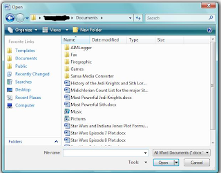
Then Windows 5 came along, and they offered some additions, nothing too different, but changes nonetheless:

It basically was the same file dialog from Windows 4, but they added a quick directory pane to the left side. Now one could easily jump to popular locations without having to do much more than a single click. Now I'm a bit sketchy on this detail, someone correct me if I'm wrong, but I recall you couldn't add or remove which quick location buttons appeared on the left, unless you installed Tweak UI, which makes the feature a bit useless by default.
What annoyed me most about the quick location buttons though was how useless it was. If you're not on a network, what does Network Places do for you? You also had quick access to the desktop, which, if you use your desktop properly, is quite pointless. The desktop is a good place to gather links (shortcuts) for frequently used apps, not to gather applications or various documents. How often does someone who cleanly manages their computer need to jump to the desktop to launch an application via a file open dialog? For those of us who know how to type, My Computer shortcut there was also pointless. Why would I go to My Computer? To open F: perhaps? I find typing F: directly to be faster than moving the mouse and clicking, and if I had more details about where I wanted to go offhand, I would enter that too. I ended up feeling while this was an intriguing addition, it was completely useless to power users - those who managed their files neatly, knew how to type, and had more of a clue where they kept their stuff.
Another highly annoying thing I found was the entire virtual directory setup. First there's My Documents. What exactly should one be storing in My Documents? When I first noticed that in Windows 98, I figured that's where various text files, papers, spreadsheets, and presentations might go. Should I stick source code to my app in there? Should I have Command & Conquer 3 store its save files there? If I was ripping a DVD would it go there? Should my virus scanner save log files there?
Now if I'm in My Documents, and I press directory up, instead of going to my home directory, I reach My Desktop. What's the logic behind this? And don't try to go up from My Desktop either, you won't go anywhere. Your home directory compared to UNIX also seems completely illogical. What does one put in their home directory? A casual glance at it and you see My Documents, internet browsing related directories, and hidden application settings. Would I put my personal applications here? What about stuff I want to share with all users of the computer, say pictures of my kids? Now I personally would set aside a whole drive for things like pictures of the kids and have it all organized neatly, and then have it symlinked to from the home directory of each family member. Yet Windows seems to not really have any provisions for this. Symlinks are non existent, and the shortcut system is a joke, which just constantly acts weird when you try to set a link to another drive or directory and you scratch your head wondering why did a new instance of Windows Explorer just launch?
I'm told Vista got some of this user stuff improved, but I've yet to see it, as I don't feel like shelling out several hundred for something I've already spent a considerable amount on for previous versions.
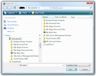
I'd appreciate if users of Windows 6 (Vista) could write in and tell me if we actually have sane home management, and that the virtual directory nonsense has been sanitized. Also would be nice to know if one can easily add or remove quick locations this time around.
Oh and before I finish on this one, Windows 5 also allowed thumbnail viewing of multimedia files in the file dialogs, in addition to other useful views added.
Now lets take a look at some of the UNIX counterparts.
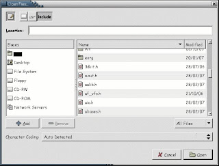
First off we have the despicable GTK/GNOME file dialog. Sorry for those of you that now have to go poke their eyes out from seeing this, but it has to be shown:

Now while it looked pretty much the same as it does now compared to say, 3 years back, it has had some changes since then.
It displays a directory/file browser quite clearly along with the date of everything in a simple scroll down view. Don't bother looking for any way to change the view or to get any additional details to show up such as file size. I assume they think they make up for it though by allowing you to reverse the order of the alphabetical sorting, or by allowing sorting via date. Although like other open dialogs, they got the file type filter right. Now in style with a group which likes to copy everything Microsoft does with Windows, but try to put a new spin on it and say all their goals are to do everything different than Windows; they copied the quick locations browser on the left, right down to a completely useless irremovable desktop quick location. Although it's nice to see they included home, and surprisingly enough they have a section where you can easily add or remove your own additions to the quick locations (but not remove the built in ones).
One thing which might be an improvement is the crumb browsing on top. Unlike Windows 4+ where they offered a drop down of the directory tree, you now see each directory component in a button by itself, and you can easily immediately click on the one you want to jump to. This mechanism was also combined with the traditional up button which is no longer needed with this interface. A nice idea indeed, which I think might make life easier for more inexperienced users, and perhaps getting them more familiarized with what a full path is.
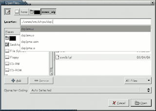
Although those of you who looked good at that file dialog must be scratching their head, wondering where is the box to type in the file quickly or to change paths? Now in earlier versions of GTK, it simply didn't exist, even though everyone who used a file dialog from the past decade had access to one. After enough pressure from users demanding one, they finally added it, albeit it's completely hidden and doesn't appear till you start typing something. Heaven forbid a new user should see an input box, it's of course much better to have a user think this is an old version of GTK, where they can't navigate quickly </sarcasm>.
Speaking of navigating quickly, for some reason this utter disgrace also takes forever to display any directory with many files in it. But it doesn't just stop there. When they finally got around to secretly adding the quick navigation field, they decided to put an auto complete feature in. Sounds great, right? Wrong! I'm in Firefox and want to tell it to open the file I just downloaded with KWrite. I go to input "/usr/bin/kwrite", after I type in "/us", it finished scanning for matches to "/u" as "/usr" and replaces it, leaving me with "/usr/s", forcing me to backspace in middle of typing, and then go through the same nonsense again with the "bin" component. But it hardly stops there, I've seen this thing freeze before when trying to auto complete whatever I was typing for a good 10 seconds or more, which is completely unacceptable. But then just when I got "/usr/bin/kwrite" entered and am hoping it's now going to launch KWrite for me, it instead freezes for 20 seconds loading up "/usr/bin" which contains ~2000 files (due to UNIX being made up of many small applications, and most executables being stored in one location), and just showing me the kwrite entry highlighted, where I further have to go ahead and click okay. Why the heck is this thing so freaking slow? And why the heck didn't it just load KWrite once it saw it was an absolute path to a file?
And if you haven't guess it yet, no this garbage can't do any kind of file management from it's file dialog.
After having to put up with this annoying broken piece of trash, I'm trying to find a replacement to every GTK application I use in UNIX where I might have to use a file dialog for some reason. If you know of a way to get Firefox plugins working in Konqueror, or of a GAIM replacement with a similar interface, drop me a line.
GTK/GNOME is just downright awful, and don't just take my word for it, even Linus Torvalds says so.
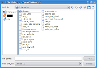
Next we have the Qt4 file dialog. Qt wraps to whatever native file dialogs are for that system, so on Windows you'll see whatever Windows does for that version, and on Mac OS X, whatever it does. For Linux, *BSD, Solaris, or any other UNIX, since there is no native GUI, it creates it's own. Let's take a look:

It looked pretty much like what you get from Windows 4. Everything Windows 4 can do, this can too. There really is only one difference (which I personally like a lot). The drop down on top instead of showing just the name of the recent path and offering a way to go up to previous components, it displays the full path every time, and allows it to be edited! I enjoy this a lot, as I can easily type in where I want to go, with it being obvious where to put this data. But this goes a step beyond anything we've looked at till now, for it has
good auto complete! If it finds a match to what you were typing in, it displays the match, but for anything extra you entered gets properly inserted into the match replacement string. I think this is the file dialog that all others should be judged against.
Next we'll look at the modern KDE 3.5 file dialog. Although KDE 3.5 is based on Qt3, and KDE 4 will be based on Qt4, they reimplemented anything to do with files. They did this not just to perhaps improve on Qt's file dialogs, but because KDE can transparently work with files across all kinds of network protocols, which Qt or for that matter other APIs don't. Let's have a look:

Looking at this, it seems to be pretty much the same as Qt4, except it inherited Windows 5's location buttons on the left. Now while I don't care for some of the default buttons such as Desktop, everything here is fully editable - as it should be! One can right click on any of those locations to edit an entry, delete an entry, or change its icon. One is free to remove any of the default ones if they don't like them or feel they're useless. To add a new one, you can either right click, and select name, path, and icon, or you can just drag a directory from the browsing pane right into the location pane!
What's more though is that this thing is super configurable. You can click on that wrench icon to change the options as you want. If you don't want the quick location pane, you can easily turn it off. If you prefer to have directories and files split into two separate panes like Windows 3, you can do that too. You can also select to see regular or detailed view. During even the regular view though, you can tell it how you want things sorted from the wrench drop down. If you want to see multimedia files displayed as thumbnails as you browse like Windows 5, that's a configurable option as well. Yet this goes above and beyond to combine fast browsing and thumbnails. You can tell it show a thumbnail box on the right, which will only show a thumbnail for the selected file, so you can easily preview without having to slow down browsing by generating all those thumbnails. Thumbnails also go beyond multimedia files, for text files, it will display the first few lines of text.
Now regarding the path entering on top, you can enter any path as you like. Like Qt4, it offers very good auto complete, yet goes even a step beyond. When entering a path, it also tries to auto complete, but the drop down displays all matching paths (see image above). So you can easily press down to select the first one and continue typing, or you can select one of the others ones too. And as mentioned earlier, this works with all kinds of protocols. If you wanted to open a remote file from some website, you can easily enter http:// and the URL, or you can browse some FTP site with ftp://, and enter a user name and password when prompted if need be. It also works for Windows networks, or for browsing any system you can SSH to, or any other protocol you can think of, provided that KDE's I/O library supports it.
The only missing feature here is that you can't rename files from the file dialog like you can in Windows 4+ and Qt4. I always found that feature useful if you wanted to save a file as the same name as something existing, but wanted that old file to be backed up. Perhaps some KDE developers have been spending too much time with GNOME/GTK devs.
Speaking of which, I've been previewing some stuff for KDE 4. Now while I have no idea what the final product would look like, some changes as they currently stand are a bit disturbing. The KDE developers said they were changing the system to use the
Dolphin interface. The Dolphin interface seems to be inspired by GNOME/GTK. They took a leaf out of their book and are providing a crumb based path above, so you can jump around like you can in GNOME/GTK's file browser. Although they mention they want to improve it by making each of those a drop down. A drop down would allow one to jump to sibling directories, although that wasn't in the build I was testing. Now the path editing I love is also there, although you need to click a button up top to switch to it. If they don't allow you to select the default method, or perhaps always display both, I will be quite upset. However their crumb browser seems to have adopted stupidity from Windows as well. It now adopted the whole virtual directory idea that Windows has. So say I'm in my home directory and want to go up one so I can select my spouse's home directory, no dice. One can't select a crumb before their home directory, as nothing exists above it when you jump to home. I don't know why KDE devs are adopting stupid GNOME ideas, or taking a step backwards to design mistakes and oddities from Windows, but I sure hope someone knocks some sense into them soon.
If I wanted to design a good crumb based editor, I think I would merge the various ideas. Have the kind of input box we're used to, but make it that each slash turns into a button which you can use to delete the path components after it, or drop down with a list of sibling directories.
Finally, let us take a look what Trolltech has in store for us next. They are redesigning the dialog for Qt 4.3, and one can download a development snapshot and play with the new file dialog. Although based on what I heard, they don't plan on changing it much from what they have in their repository at the moment . Here it is, direct from my personal compile of Qt 4.3's repository as of yesterday:

I don't know what they did. Perhaps Trolltech hired some bozos who work on GTK to come up with this. They seem to have more or less taken from KDE 3.5 the quick location pane on the left. It has sane defaults, and you can remove what is there, or add by dragging from the main browsing pane. Yet no editing of any sort, or adding by typing in a path is available. Your changes don't seem to be saved in any way either from one run to the next, making customizing it pointless. I don't know why they didn't just replicate what KDE 3.5 did here, as they had it perfect.
For your browsing, details view now seems to be the default, although you can change to the old default of list view. Now in detailed view, the only thing you see is file name and date, just like in GTK. The copying of stupidity is uncanny. It seems they removed features and changed defaults to make it resemble GTK more, for some absurd reason. Thankfully though you can rename and delete files here, but surprisingly enough, there seems to be no way to create a new directory.
And those of you who have been paying attention, of course will wonder, where is the path editing box? Yet again it seems they copied GTK and hid it by default, to reach it you have to click on the browsing pane, and then start typing. Not at all intuitive, and sadly, seems to be copying a bad Qt knock off. At least the path editor though has the improved auto complete seen in KDE 3.5.
I don't know what's becoming of KDE and Trolltech these days, they seem to be taking the bad from GTK/GNOME and throwing away their own good technology.
But that file open dialog from Qt 4.3 is really freaking me out. I can't even begin to describe what a major step backwards it is. What happened to the sanity? Where's the intelligence? Where's all the good stuff? Why am I looking at garbage from a lesser API,
in the best cross platform one available?!? If they wanted to improve it, they should be taking what they can from KDE 3.5. Someone needs to smack somebody at Trolltech - hard.
If anyone has any more details, or knows of planned changes, please post about it in the comments. If I get more details, perhaps I'll do a part 2 in the future.
